
The graph below shows the percentage of households with different kinds of technology in the U.S. from 1995 to 1999. Summarize the information by selecting and reporting the main features, and make comparisons where relevant.
Write at least 150 words.
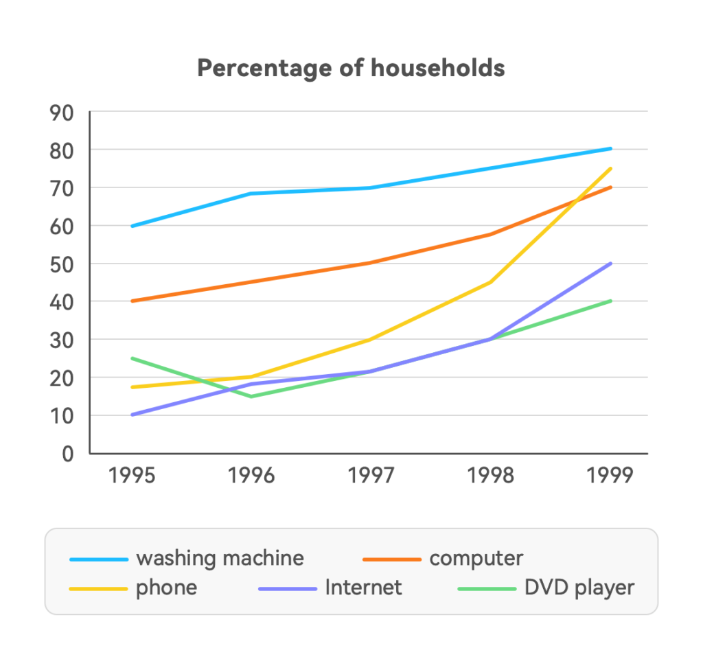
This line chart contains the proportion of families using various categories of technology in America and the trend of change between 1995 and 1999. It can be seen that almost the use of all sorts of technology rose clearly from 1995 to 1999 except for the use of the DVD player in 1996.
The most popular device during this period always was the washing machine and eventually, its ratio got 80%. The second most fashionable machine was the computer, but it finished the third place after four years change. The phone became more and more popular and finally surpassed the other three in ranking. The use of the Internet had an obvious increase, at the end, about half of families accessed the Internet.
On the contrary, it seemed that the DVD player was out of favor with people. It fell back to its lowest point in 1996 and remain the last one although it passed through a three years growth.